Overview
This project is an attempt to study, understand, and apply UX design methodologies to create a conceptual feature update to the game Elden Ring. Elden Ring is a "souls-like" action-adventure game, that focuses heavily on the player exploring, finding, and using items in the world to enhance their character's abilities to become more powerful.
Job roles: Player journey, Flowchart, Wireframes, High-Fidelity mockups
Timing: 8 weeks
Tools: Figma, Illustrator, Photoshop
In-game experience

Updates made

In-game experience

Updates made
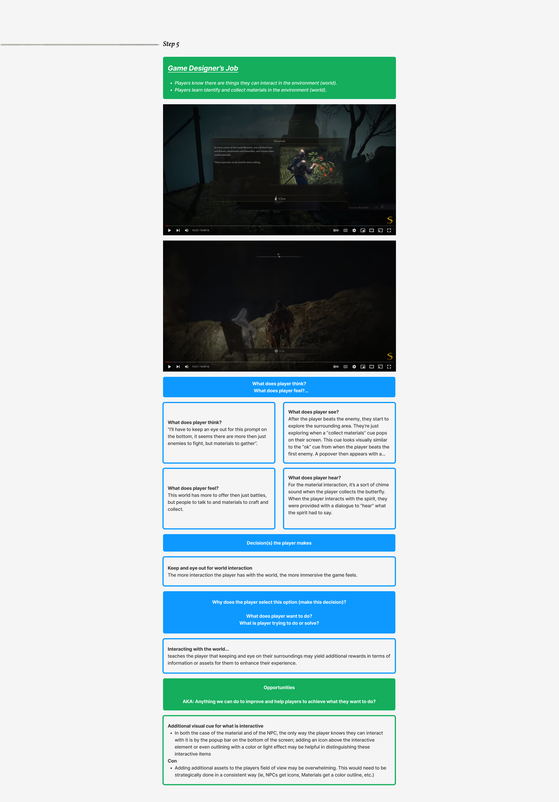
STEP 1
The player's journey
For the first step, I chose to work on a game that I was not familiar with so I could focus on observing the player's journey without too much bias. I watched a video that highlighted what the player was trying to accomplish during the initial onboarding period of the game. By observing this, I was able to figure out what decisions players could make and what they were trying to solve or accomplish as they were immersed in this new world.
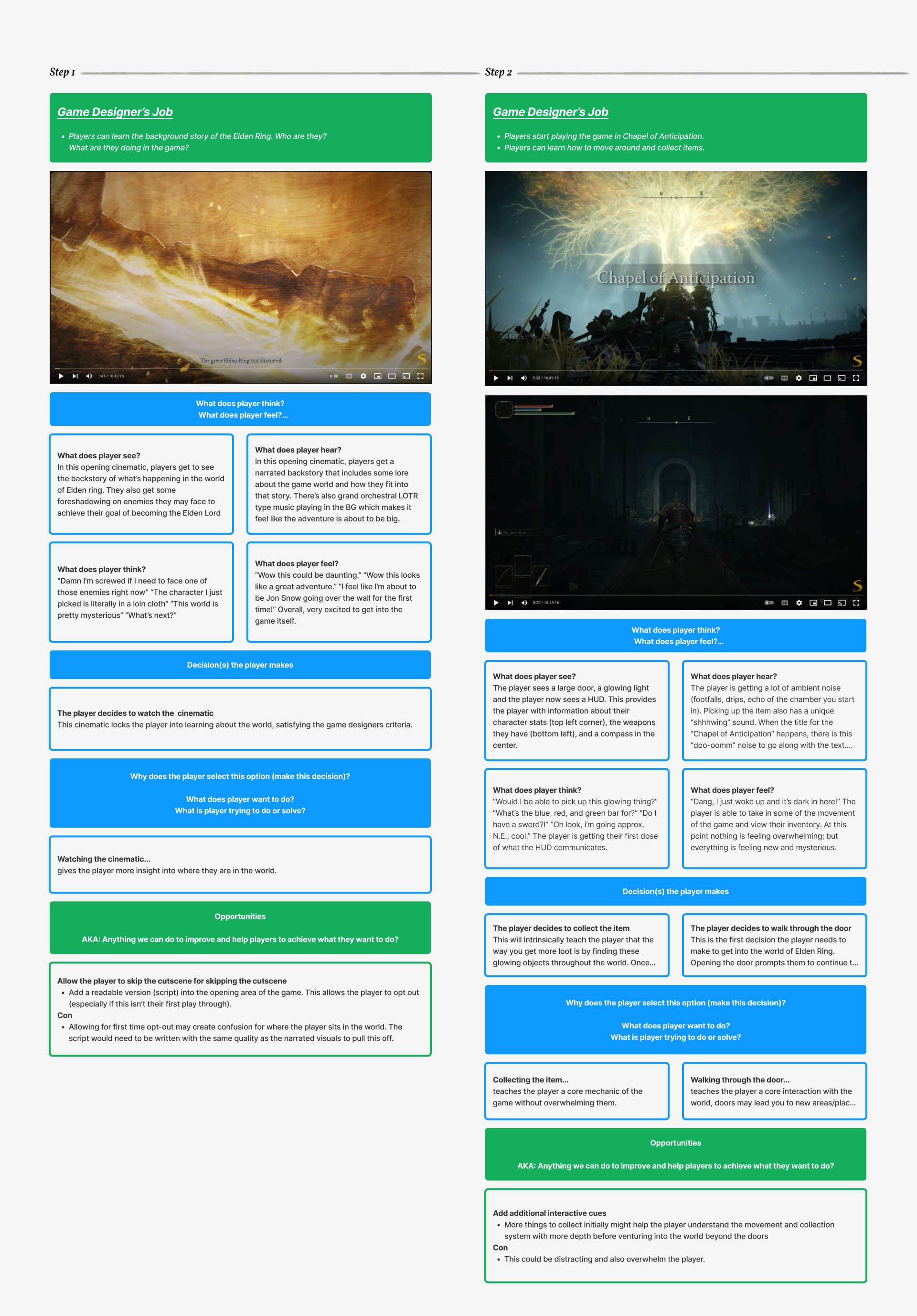

STEP 2
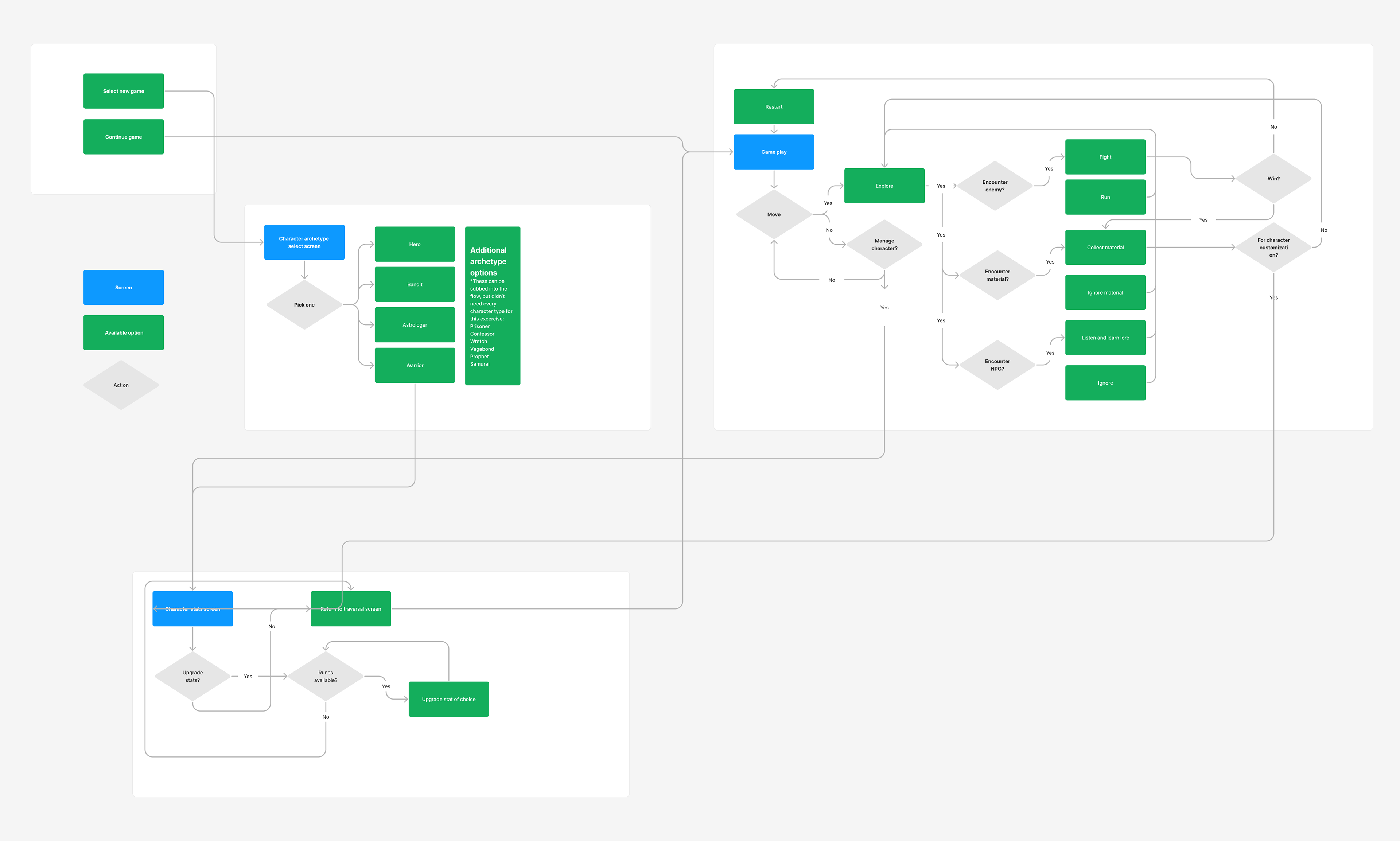
"Paper Prototype" and Flowchart
Once I established some of the key components of the player's journey, my next step was to describe the player's options and build a flowchart that showed how those decisions could be made. This exercise helped drive very high-level thinking about the game design and how it would ultimately map to how I could improve the game's communication to the player via the wireframe and high-fidelity mock-ups.
"Paper Prototype"
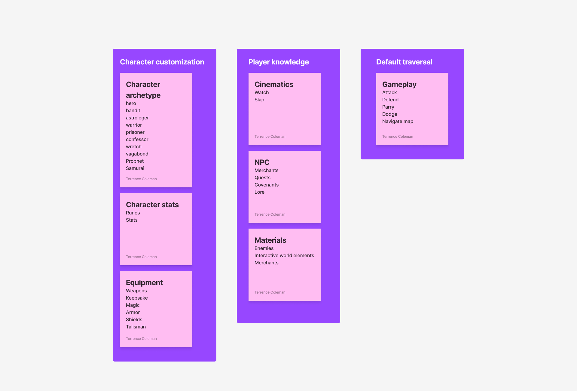
Flowchart
STEP 3
Wireframes
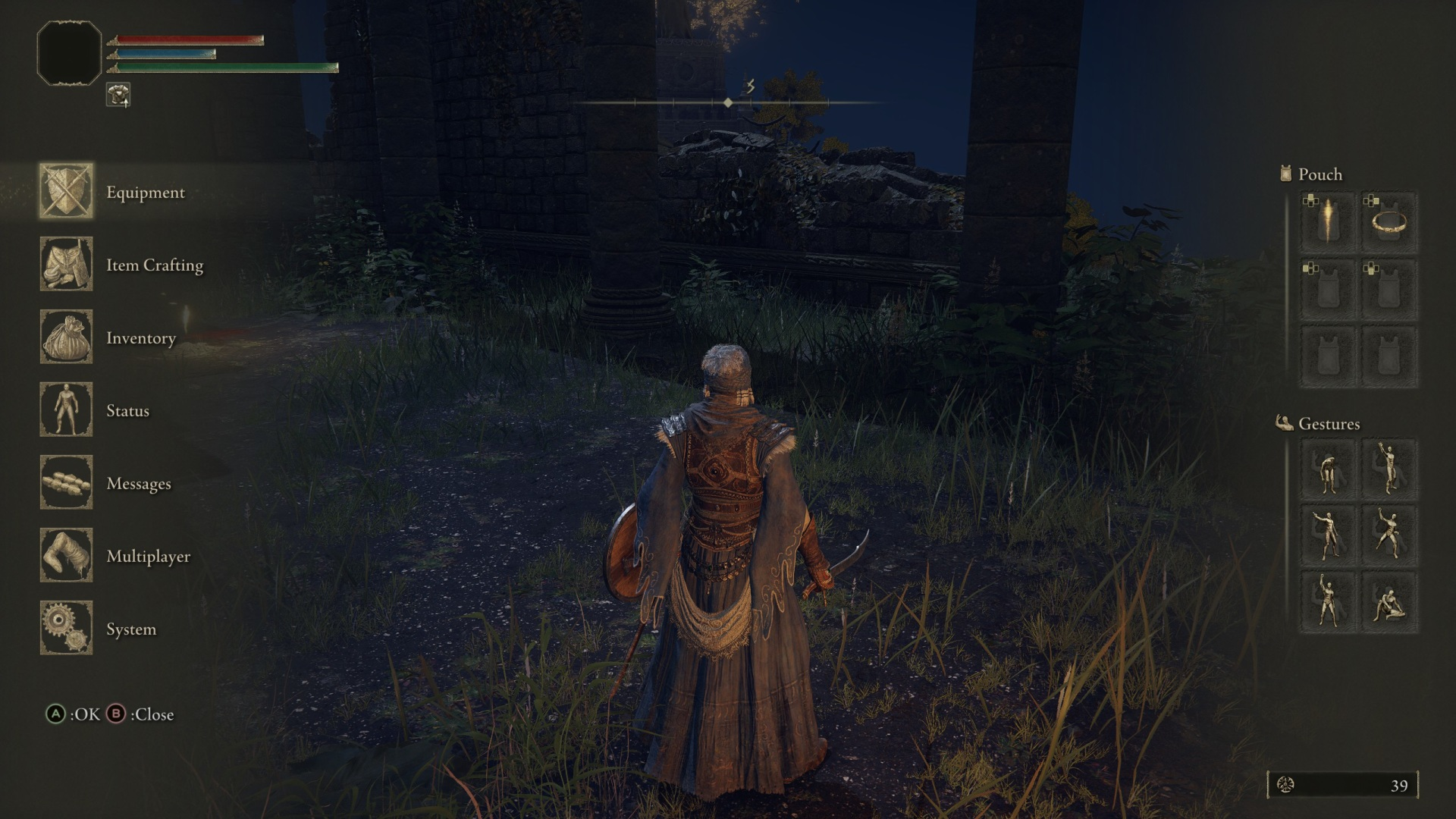
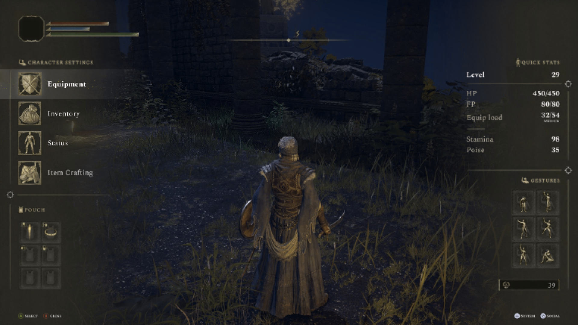
After working through the various player flows, there was an area in the game that felt like it could be improved. Because of how Elden Ring works, players are constantly fighting and picking up loot from battles and general exploration. One of the most challenging areas in the game to learn and navigate is the inventory system. This is what I wanted to focus on for this project; how we might improve the communication around how inventory is managed and create any enhancements to the current system?

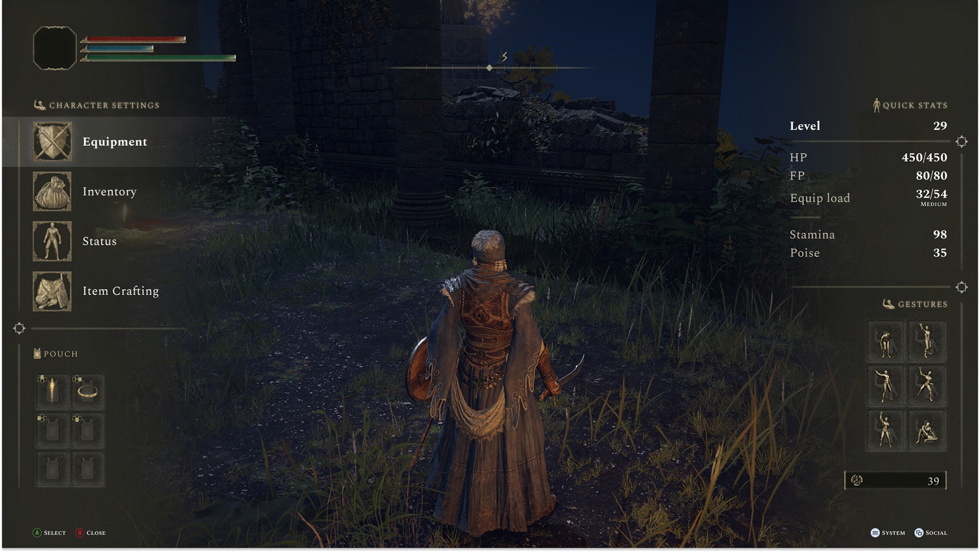
Player menu
The Player menu is where the player can access all in-game items and manage their characters.

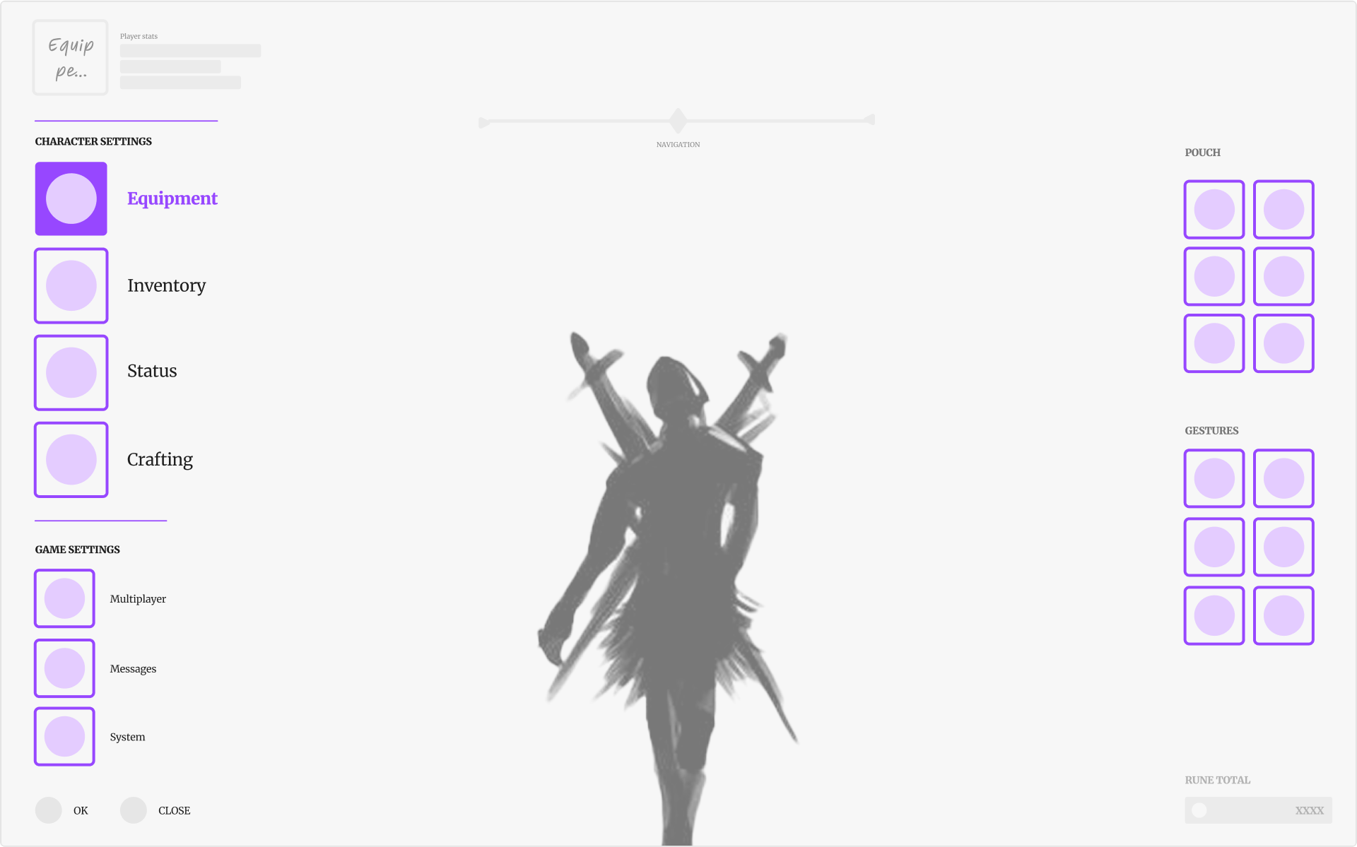
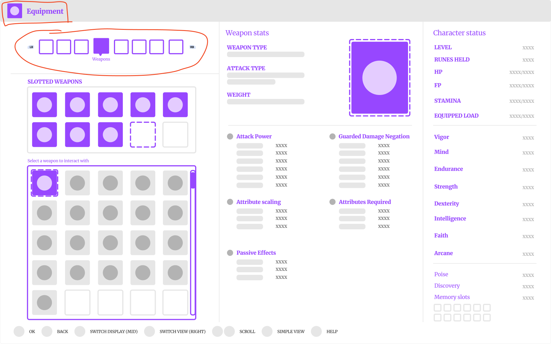
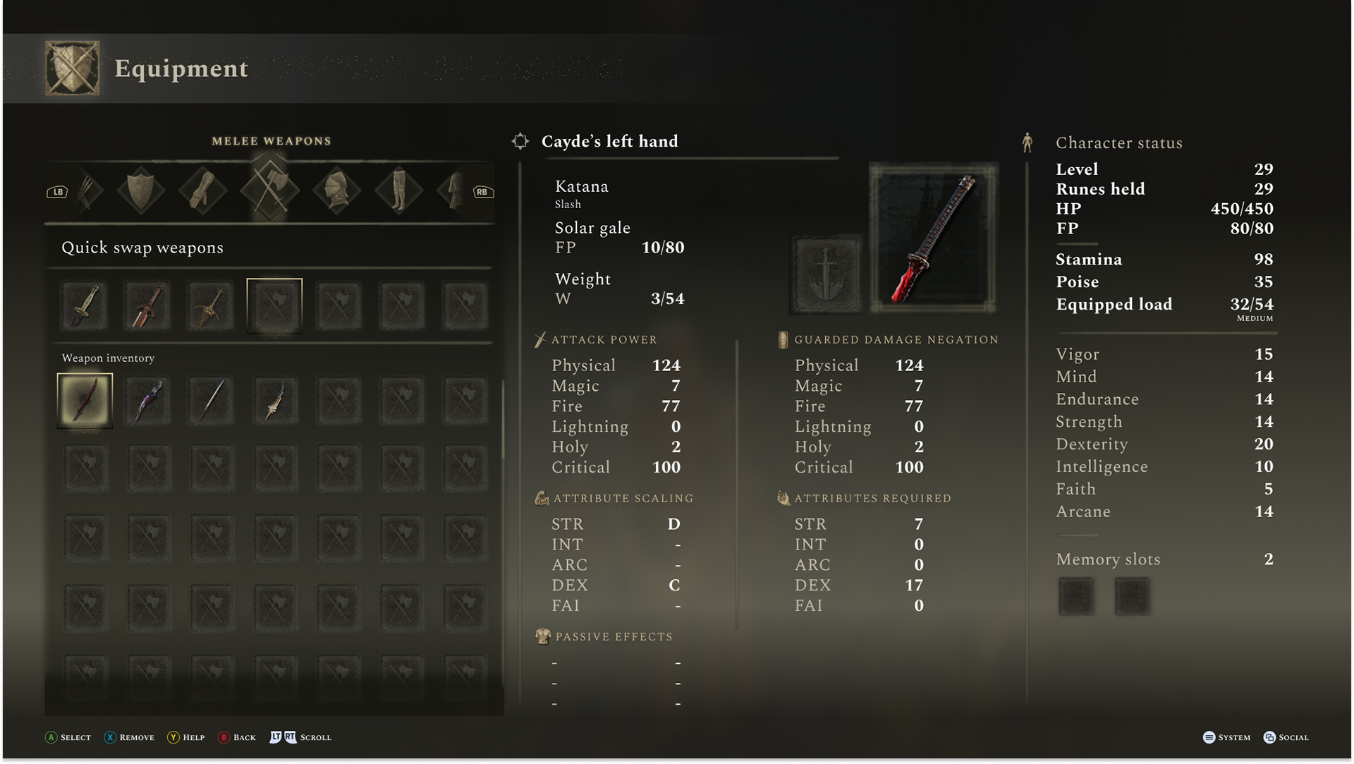
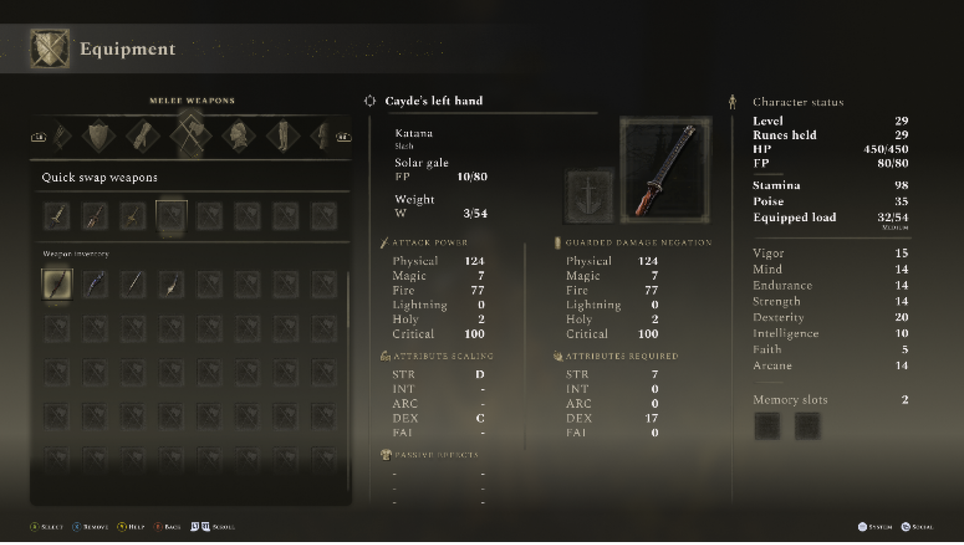
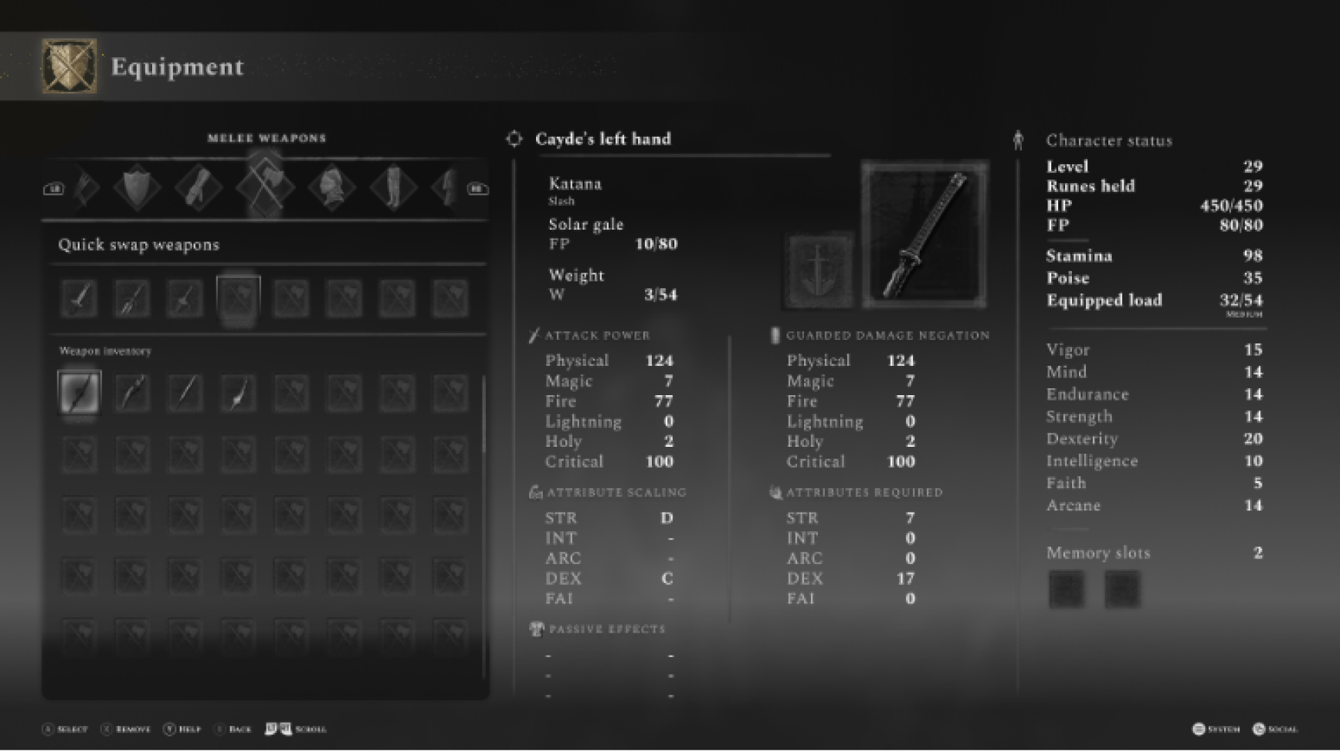
Equipment menu
The Equipment menu is where the player can equip any of the items they find around the world of Elden Ring.
ENHANCEMENT
Quick-swapping weapons
As I started to investigate the organization of the equipment menu, I came across the idea of "weapon quick-swapping". This was something that players were doing in the game even though it was not easy due to how the inventory management system was set up. I felt like this would be a big win if there was a way to make this hack into a native game feature.
Player menu wireframe
This was the initial pass at re-organizing and creating more hierarchy on the player menu.

Equipment menu wireframe
This was the initial pass at
re-organizing the equipment screen with "quick-swapping" in mind. The "inventory level" categorization was also added to make it easier to understand what item type you were looking at.
re-organizing the equipment screen with "quick-swapping" in mind. The "inventory level" categorization was also added to make it easier to understand what item type you were looking at.
SESSION 1
Player Feedback
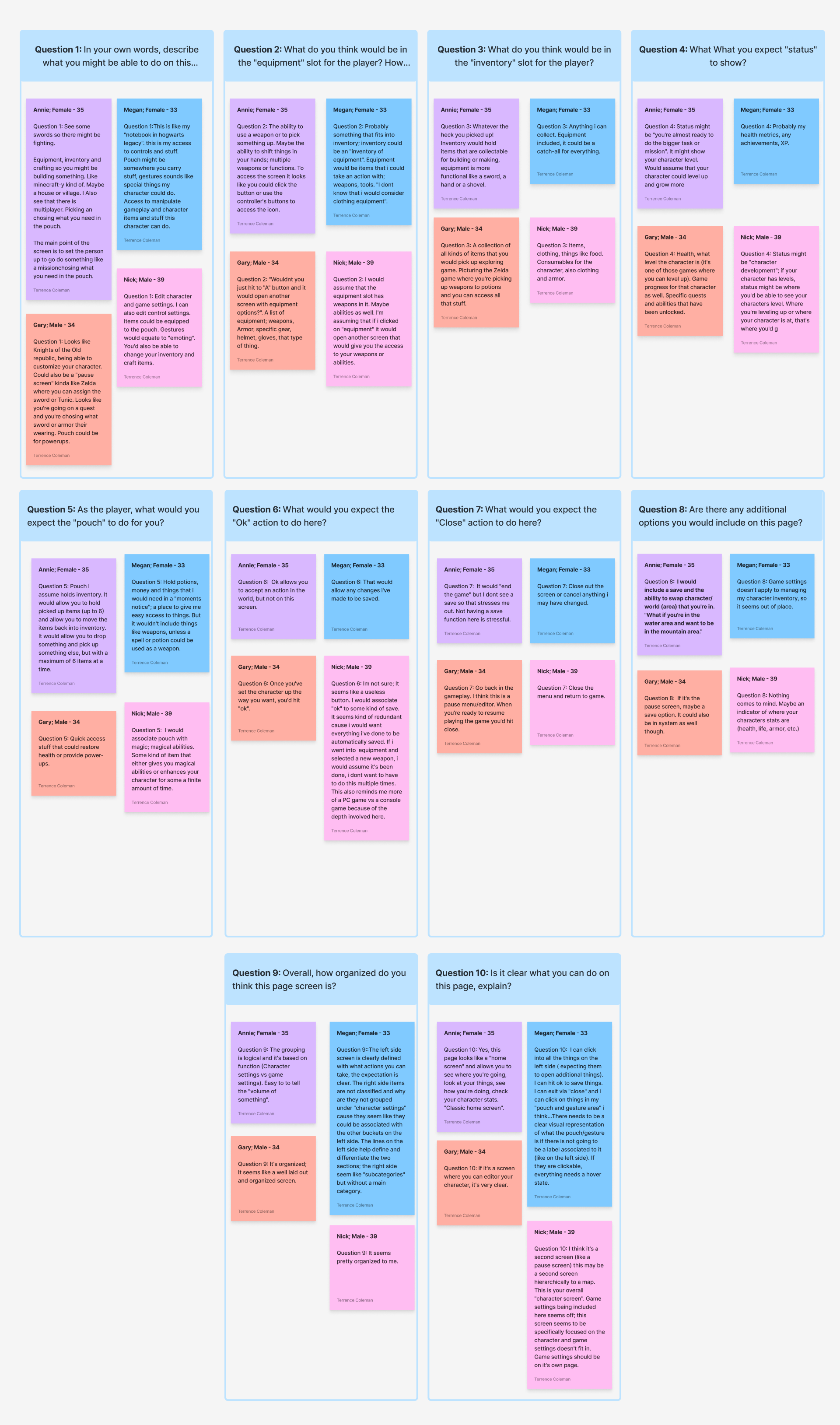
After I created the initial set of wireframes, I interviewed six players with varying levels of game experience. This was a great opportunity to see if the changes helped increase the usability for the players, regardless of their familiarity with the game itself.
Player menu feedback
Equipment menu feedback

APPLIED UPDATES
Elevating the player experience
The feedback provided by the players was integrated and added to the wireframes. This helped refine the organizational hierarchy of both screens and simplify the total interactions the players needed to take to get to where they needed to be.
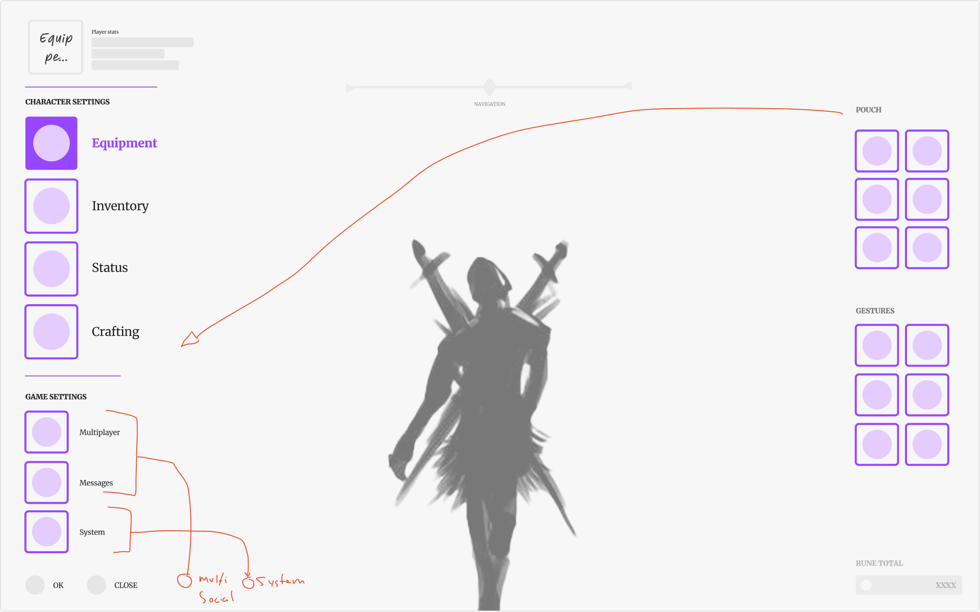
Updates to the player menu
Ultimately, players felt like there was too much happening on this screen in the initial wireframes. I reduced and bucketed the "settings" and "multiplayer" items down to the system level. By doing so, a more clear hierarchy emerged.
Updates to the equipment menu
Initially, players had a hard time understanding what the top-level item categories were. They kept thinking they were only able to select weapons. By adding a label to the category, players were able to quickly understand what they were going to see on the screen.
ASSIGNMENT 4
High-Fidelity mockups
Once the wireframes were refined, I built a UI mockup that incorporated what I learned in the previous steps. I focused on the game's visual language to make sure that the adjustments I was making would still fit into the world of Elden Ring. One thing I paid specific attention to was creating a better visual hierarchy via typography size and weight. I chose to extend the color palette and use more accessible color options that still felt on-brand for Elden Ring's dark, medieval horror-focused aesthetic.
USER RESEARCH
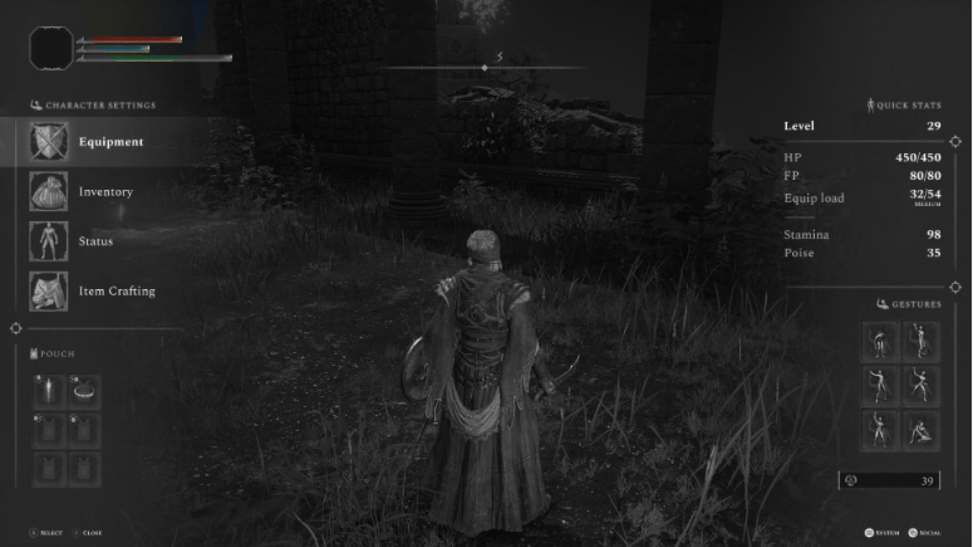
Color study
After updating the color selections, I ran a color study to determine if the changes made helped with different color blindnesses. This includes protanomaly (certain shades of red look more green), deuteranomaly (certain shades of green look more red), tritanamoly (hard to tell the difference between blue and green and between yellow and red), and monochromatic.
Protanomaly

Dueteranomaly
Tritanamoly

Monochromatic
Conclusion
Working through the steps of understanding and developing a player experience was enlightening. By working through these steps, I was able to better understand the level of craft and detail that something as "simple" as an inventory screen needs to communicate to the player what their options are successfully, and in a way that does not "break" the immersion the game provides.